Introduction
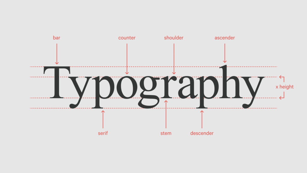
Typography is one of the most powerful elements of design. When used correctly, it enhances readability, strengthens visual hierarchy, and elevates the overall impact of a design. Whether you are a beginner or an experienced designer, mastering typography rules is essential for creating effective and visually appealing designs.
Below are the most important typography principles every designer should follow:
1. Readability Comes First
Always prioritize readability. Choose fonts that are easy to read across different devices and screen sizes. Avoid overly decorative fonts for long text and ensure proper font size for comfortable reading.
2. Choose the Right Font
Every font carries a personality and emotion. Select fonts that match the purpose, mood, and tone of your design. For example, serif fonts often feel formal and traditional, while sans-serif fonts appear modern and clean.
3. Maintain Consistency
Consistency in font type, size, weight, and spacing creates a professional and polished look. Avoid unnecessary variations that can distract the viewer.
4. Pay Attention to Spacing
Proper spacing improves both readability and aesthetics. Focus on:
-
Letter spacing (kerning)
-
Word spacing
-
Line spacing (leading)
Well-spaced text feels balanced and easy on the eyes.
5. Align Your Text Properly
Use text alignment intentionally—left, center, or right—based on the design’s structure and purpose. Consistent alignment creates visual order and clarity.
6. Use Visual Hierarchy
Typography hierarchy guides the reader’s attention. Use variations in font size, weight, and style to distinguish headings, subheadings, and body text.
7. Limit the Number of Fonts
Using too many fonts can make a design look cluttered. Stick to a maximum of two to three fonts per design to maintain harmony.
8. Ensure Strong Contrast
Good contrast between text and background is crucial for readability. Dark text on a light background or light text on a dark background works best.
9. Pair Fonts Thoughtfully
Choose fonts that complement each other. A common and effective combination is pairing a serif font with a sans-serif font for balance and contrast.
10. Avoid Excessive Capitalization
Too much capitalization reduces readability. Use capital letters mainly for headings, acronyms, or emphasis.
11. Use Proper Grammar and Punctuation
Errors in grammar or punctuation can reduce the credibility and professionalism of your design. Always proofread your content.
12. Control Line Length
Avoid lines that are too long or too short. The ideal line length for readability is typically 50–75 characters per line.
13. Use a Grid System
Grids help organize content and create balance. Grid-based layouts bring structure, consistency, and visual harmony to typography.
14. Experiment with Font Combinations
Don’t be afraid to explore new font pairings. Experimentation helps you develop a stronger sense of typography and design aesthetics.
15. Use White Space Effectively
White space (negative space) improves readability and helps important content stand out. Crowded text can overwhelm users.
16. Consider Cultural Context
Fonts can carry cultural meanings. Be mindful of how typography may be interpreted in different regions or contexts.
17. Never Stretch or Distort Fonts
Avoid stretching, squashing, or distorting fonts to fit spaces. This damages legibility and the integrity of the typeface.
18. Stay Updated with Typography Trends
Typography trends evolve. Staying updated helps keep your designs modern, relevant, and visually engaging.
19. Understand Typography Psychology
Typography influences emotions and perception. Understanding font psychology allows designers to communicate messages more effectively and connect with audiences on a deeper level.
20. Practice Regularly
Typography is a skill that improves with practice. Experiment with layouts, font styles, and spacing to sharpen your design sense.
Conclusion
Great typography is not just about making text look attractive—it’s about communicating clearly and effectively. By following these typography rules, you can create designs that are visually appealing, professional, and impactful.
Master typography, and your designs will speak louder than words.